
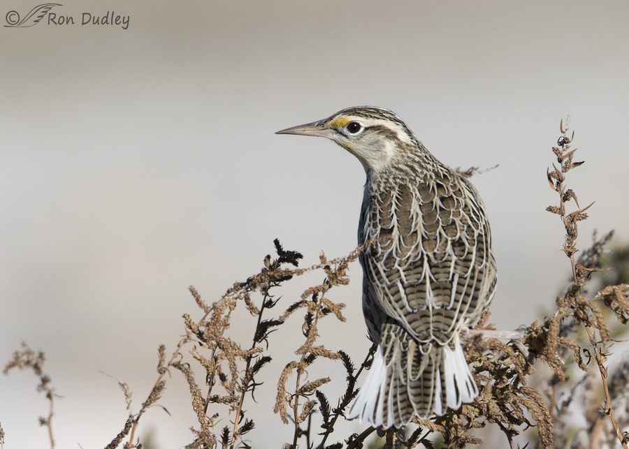
I almost deleted this image on my first culling pass because I thought it lacked pizzazz. It has a near-monotone color palate, the bird has its back to me and the setting is, well… different. But as I inspected the photo more carefully it began to grow on me.
1/4000, f/8, ISO 640, Canon 7D Mark II, Canon EF 500mm f/4L IS II USM + EF 1.4 III Extender, not baited, set up or called in
I took the image three days ago along the Antelope Island causeway so the background is sand and mud along the shoreline of the Great Salt Lake.
There are relatively subtle elements in this image I enjoy including the splash of yellow in an otherwise mostly colorless palate that draws my attention to the meadowlark’s face and large eye, the interesting and attractive plumage patterns on the back of the bird and the flared tail. And the setting reminds me of the threatened lake I love, though that feature may appeal only to me.
The tastes of viewers vary widely and I expect the reaction to this image may be tepid. That’s ok and completely understandable – after all I almost deleted the photo myself. But occasionally I like to feature an image like this just to stir the pot a little (and to get some feedback).
If you choose to comment about the image please be honest about what you may like or not like. I can take it – really I can. Image critique is part of the reason I blog and I’d be interested in your reactions, either way.
Ron
PS – I’ll delay responding to any comments so what I say doesn’t influence the comments of others down the line.
No meadow larks over here in the east. I am impressed by that long beak too.
Very intimate portrait. Love the feather detail and the subtleties of the bird against the background. Great photo!
I agree with what Kris said. At one time I thought female House Sparrows were so bland. As I took the time to really study them, I completely changed my mind. Their pretty. Their face is so sweet looking. Some people wouldn’t agree with me, but that is ok. No such thing as a bland bird in my book.
I like your pic Ron!
Okay, not so much colour as from the front but definitely interesting markings and good for field ID.I like the composition. Being picky, I would have lightened the dark grasses to the left of the bird and cloned out the stuff peaking out to the right of this bird, as it is somewhat distracting. Possibly cropped top and left, a little.I would have accepted the grass merging over the bird cause that would be, for me , difficult to remove..Easy to see these issues in others’ photos, not always my own. Ew-w-w, now I feel really picky, and I have great respect for your work.
If youbcame close to zapping this image, I’m not sure you can be trusted to “cull” your own stuff…..have worried about this for a while……
YES!!!
HAHA Patty! I was going to say something like that and chickened out. YAY for YOU! 🙂 I think Ron needs a THWAP upside his nit picky head sometimes…LOL!
I’m in here too as the birder. Show us!
The way the feathers are outlined in spectacular. I never see that in my bins. Keep it coming! I WANT to see it close up. I’m not looking at a collection; I’m in the field and don’t see the intricate details.
I am so glad that something stopped you from ditching this.
I LOVE the intricate detail and beauty of the plumage pattersn. And the grasses/branches.
Pizzaz/firewords have their place but so does subtle beauty.
I love this photo. I know zero about the technical aspects, so I can only talk about my feelings. Since I was introduced to your blog a few months ago, your posts have become a highlight of my day. Your wonderful photos convey a sense of action and immediacy that I find very engaging, and I’ve learned a lot. This image, though, captures mood and a sense of timelessness that, to me at least, is almost meditative. I’m so glad you didn’t follow your first impulse — thank you!
I think the picture is lovey. Like the detail in the feathers. Don’t throw away a nice picture and topic.
This photograph reminds me of why I love black and white photography: the patterns, the variations in tone, the composition stand out, instead of letting the color do all the work. But it IS in color, and I get to see that, too! I love it. As far as composition, I would like a little more room around the tail feathers, if this was a crop. (Also reminds me of how my photo professor didn’t allow us to crop our images. We had to make our own negative holders out of cardboard so we got true full frame.)
Thanks very much for all the feedback everyone. The comments so far are more positive than I thought they might be and I find that interesting. And encouraging. I thought I might be way off base on this one.
I neglected to mention this photo’s subtlety and I’m delighted that so many others didn’t neglect to mention that. Subtle beauty is often utterly magnificent. I also meant to take issue with the “monotone” descriptor. Grumble! Take, for example, the subtle beauty of the desert. How many folks dismiss the desert as monotone and featureless when the reality is, they’re missing it because they’re just not paying attention to its details. Whispers are often so much louder than shouts 🙂
This, along with one of your magpie images, will remain one of my unexpected favorites….for all the reasons stated by others. I was first caught by the beautiful, outlined in white, lacey feather patterns, then the graceful curve of the bird’s beak and throat, then the harmony of colors and the composition. Many of my favorite birds are NOT flamboyant but very subtley colored, almost monochromatic. This is a beauty!
I like this photo. I’ve long been a fan of monochromatic color schemes. What immediately jumps out at me are the patterns in the feathers on the bird’s back, which are very attractive. I also think the seed heads on the plant sort of echo that pattern. It may not be a bright, sunny photo, but I like the subtle colors and am glad you kept and posted the image.
I love the patterns and colors ! Nature isn’t always flamboyant but it’s always beautiful !
Thank you for proving that in every image , every day !
When coloration of an image is subtle, the patterns and values are allowed to dominate…….I noticed immediately that the contrasting feather
lines on the bird’s back are echoed in reverse ( of both value and direction of flow ) by the weed spears flanking its body, and both elements’
patterns are essentially the same size , creating a beautiful harmony–congratulations on such a lovely take–sure glad your delete-button
finger hesitated !
I agree with everything Laura said !!!! The only thing I would add is that it’s a great photo to usher in fall birding- I can almost feel the crisp air! Thanks for posting!
I love it. I like monochrome and subtle so this appeals to me v
It’s a wonderful shot Ron!
Charlotte
If I’d known you were thinking of throwing this image away, I’d have thwapped you upside the head–HARD! This is an exquisite capture. I’m first drawn to the feather patterns in the plumage, but unlike you, the yellow patch didn’t draw me in until a little later. Instead, I was stuck on the outrageous feather design on the meadowlark’s back, sliding down to the tail. Then the yellow patch screamed for my attention, followed by the eye and beak–the beauty of the white “racing stripe” on its head is just lovely. What outrageous magnificence!
For me, the background is last, but I love how the background colors compliment the bird, making the patterns pop and contributing to the overall wonderfulness of this shot. Then, I’m drawn back to the feathers overall–just Oh WOW! (You know the drill–insert all the unused superlatives here!)
Yeah, OK, I’m easy with birds, I love meadowlarks (another bird whose song can break your heart with its sheer beauty) and birds just rock (how do they DO that plumage design thing?). I’m easily amused. What of it? LOL! But whether you admit it or not, that’s a kick butt photo! As for those nit picky things you’d whine about, well, let’s just say that I’ve learned that perfection just isn’t necessary. Instead, I’ve learned to celebrate life (and life’s images) as they are just because that’s how they are.
I like it. For some reason, “western art” keeps popping in my head. Subtle coloration on a bird that is typically portrayed with yellow and black contrast, so it’s rather unique. You would not see this version in a Peterson’s Field guide. Technically perfect, great balance of the bird and the vegetation, not only physically but the coloration as well. And love the position of the head (sleek) and the bird is looking right at you. Got to get moving, another group of vultures came in las night and need to go out and try to catch a few in good light.
Beautiful! The feather detail shows up well as does the face of the bird. 🙂 I also like the way everything “blends in” without losing detail. I’m glad you didn’t delete it!
I really like this image. The coloration of the breast feathers of birds are always emphasized but I find the patterns of the back equally informative and inspiring, yet photographers rarely show them. Of course, having the head turned sideways helps! (I have lots of images of backs but no face, not nearly as good.). Thanks for sharing this one.
Very well worth saving & sharing! Seeing the plumage patterns is fascinating!
Once again… “Thank you” for sharing.
Ron, it’s one of my all-time favorites of yours. I’m so glad you chose to share it with us!
The delicacy, clarity and subtlety are altogether remarkable, as is the composition.
I love this picture. !! I desaturate lots of my portrait pictures. I for one am not fond of bright blue skies. Prefer clouds. Sepia and fall colors. I tend to tone down the blues in my skies. And I have many pictures of meadow larks backs. Love the pattern …. So yes I’m glad you kept this image.
Ron, overall I like the image. I’ve never seen or photographed a meadowlark, so I’m drawn to it for that reason. I like the monotone aspect of the image, and as you said the small flash of yellow works well. I like the position of the head, angled off to the left with the nice catch light in the eye. I like the pattern of the feathers on the bird’s back. The background is great. I do find the foreground branches slightly distracting, how one of them extends over the bird’s back on the left side, and the branch sticking out of the bird’s shoulder on the right side. I do think it’s an image worth posting, though, as it does a beautiful job of showing the feather pattens on the back of the bird and the nice patterns and coloration of the head.