
Most often on this blog I share my photographic successes but occasionally I can’t resist ranting over one of my near-misses.
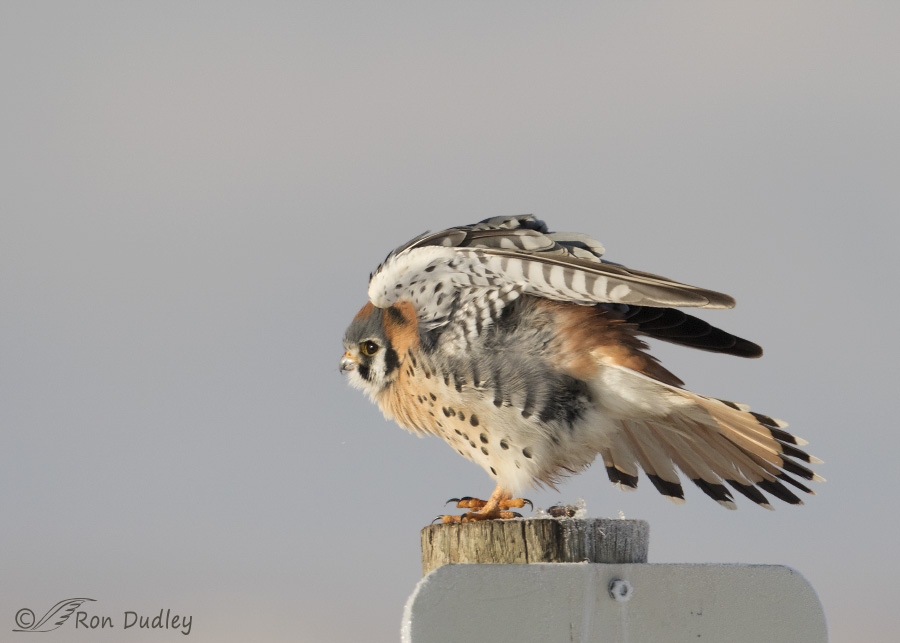 1/4000, f/6.3, ISO 640, Canon 7D Mark II, Canon EF 500mm f/4L IS II USM + 1.4 tc, not baited, set up or called in
I photographed this male American Kestrel soon after dawn yesterday morning at Farmington Bay WMA. It was quite cold (11 F.) so the bird was “sticky” as it warmed in the sun and allowed me a fairly close approach, especially for a kestrel. For most of the time I spent with him (about 9 minutes) he was facing me with his tail hidden behind the perch so I was set up for take-off (thus the fast shutter speed).
There are many things I like about this image and one that I most definitely do not.
- Most of the time the kestrel was side-lit but just before he took off (away from me of course) he turned on the perch at just the right angle to give me nice, soft light on his entire body
- I love the stretching pose with wings up, tail spread and one foot slightly lifted. There’s even a good catch light in the eye
- The background is clean and I like its blue-gray color which matches pretty well some of the colors of the bird
- I appreciate the frost on the shaded side of the perch as an indicator of the conditions when I took the shot
But I sure don’t like that perch. If it were just the post I’d be fine with it but for my tastes the sign ruins it. Many of the signs on the refuge are just like this one with the top of the sign placed within an inch or so of the top of the post. There are few trees at Farmington so raptors habitually use the many sign posts as perches and I’ve often wished that they were all placed several inches lower on their posts so they wouldn’t be visible or could be aesthetically cropped out of our images. One day I might have to have a conversation with the refuge manager about that but I doubt that such an issue would be very high on his list of priorities…
From past experience I know that perches like this don’t bother some of my readers as much as they do me.
But like Popeye “I yam what I yam” and I can’t change that.
Ron
Suggest that they affix a dead branch to the tops of the sign posts. The birds would perch on that, being higher and more convenient.
Time to put a team of photographers together, with cordless power tools (and permission of course) and lower those signs!
It’s such a sensational shot you’ll have to forgive the perch! Nothing is perfect.
Charlotte
I disagree. Usually I agree with you, but not this time…I actially like the sign…it subtley underscores incredible shot of the bird and, because you can’t see what it says, is not intrusive or distracting. The soft colors of the sign ate similar to some of the soft colors in the bird and in the sky…I’m not with you on this one. Magical, magnificent shot of the bird!!!
Patty, just so you can sleep tonight, the sign says “Designated Parking” (for hunters).
Nothing you can say will convince me to like or even accept that sign. Another thing I didn’t mention about it that I don’t like is the fact that its presence made me crop to what I think is a slightly less than ideal composition just to keep the printed letters out of the image.
Jeeez! “Designated parking for HUNTERS……??? Now you spoiled it!!!
I still love it!!! So there……
Wellllllll, he is a hunter. And he was parked.
Your post reminds me of conversations I have with my younger brother, who is a professional photographer. Apparently like you and most serious photographers, he can’t see the forest through the trees. He will take a brilliant photograph of something, like your Kestrel photo, and only bemoan some imaginary flaw. So many photographers only pay attention to miniscule technical issues and completely fail to perceive the artistic strength of the photo.
I try never to fall into that mindset. It is the overall strength of an image that matters. I certainly did not even notice the sign in your photo. The glory of the Kestrel easily overwhelmed the sign. Great shot.
Thank you, John – for your nice words regarding what you like about the image and for your perspective on the sign.
The kestrel (and rather a lot of other birds and wildlife more generally) are much less picky than you are.
I would much, much rather see a kestrel ornamenting a sign than the bullet holes which are a more common decoration on this side of the world.
And how I loved the fluffy assasin decorating that one.
EC, I’ll bet we have at least as many bullet holes in our signs as you do in Australia. Probably more. Boy, is that ever something I could rant about for a good long while!
“Fluffy assassin” – perfect.
“Fluffy assassin,” I LOVE that! I counted up the little scabs on my hands from installing the telemetry transmitter on Skye, Queen of All She Surveys three days ago. There were 32, 33 if you count where she really got the bloodletting going up under my fingernail that doesn’t show a scab. They’re tyrants, they are. LOVE Ms. Skye, but oh when she’s displeased… 😀
He’s a beauty.
Thanks, Arwen.
G’day Ron – I’ve been enjoying your photography, and learning from it, for months now. Thank you for sharing. I know this is a bit of a radical idea but have you considered volunteering to lower the signs on those posts where birds routinely perch? The refuge staff may be too busy but with a power tool and the right bit I bet you could do the job!
Peter, A friend of mine once offered to lower an ugly bat box that was placed very near the top of a short pole that had been used as a perch by Bald Eagles for years at Farmington. The offer was ignored and that damned box is still there at the top of the pole. If it were lowered 6″ it would serve bats, eagles and photographers perfectly well. As it stands every image of an eagle on that pole will include part of that ugly red box.
It’s a beautiful photo, as usual and a really interesting pose.
I always marvel how these little guys can survive doing the cold winters. They’re obviously a lot tougher than I give them credit for. As far as the sign goes, it’s almost the same color as the background and doesn’t bother me in the least. Signs and posts and utility wires and poles ARE a part of a kestrel’s natural environment. That’s where they live and there’s no reason to try and think otherwise. : )
Thanks for your perspective on this, Mark.
Perhaps it can be argued that signs, posts and wires are “part of a kestrel’s natural environment. But even if I accept that premise it doesn’t mean I want them in my images. There are many potential elements in an image that can ruin it, natural or unnatural.
When I saw your headline and then scrolled down to the image, I knew immediately what the issue was. Some things stand out like a sore thumb in an image. Foregrounds and backgrounds can spoil an otherwise good image very quickly. I have several images of those signs being used as perches. However, it’s a bird in the hand as they say, Aesthetically, spoiled broth for the trained eye. As many here have noted, the bird is gorgeous and a good example of the species. A fine image for studying the intricacies and details of the plumage, or for educational purposes such as this, but a failure when it comes to wall art. I’ll always put it in the can (camera) and see what I can make of it later in processing, if anything. The effort is the same no matter where you find a subject. Go afield, Find a subject, Capture an image (or a hundred), Repeat, Repeat, Repeat. Signs be damned.
Ha, it isn’t difficult to suspect that you and I attended the same “school” (NPN), is it, Neil? I agree with everything you’ve said here.
Gorgeous Photo. Be proud. 😎
Thank you, Nancy. I am, mostly…
Yep, I’m with everybody else. I never saw the sign beyond the utter magnificence of that diminutive boy perched on the post (NOTE: using the “L” word with Kestrels is bad. Chaos ensues to the point that the Kestrel in question is duty bound to go take down a bison just to prove you wrong! LOL!). I noticed what could be his morning casting, indicating it’s time to refill the crop, but not the sign. I also noticed the frost on the perch and the exquisite lighting, showing off all those spectacular feathers and color, including the intact tail (I’m so POed that Skye [female Kestrel] trashed her tail in a three-day period).
Looking on the bright side, as I’m wont to do regularly, the sign isn’t growing out of the Kestrel’s head as it would be if the camera were in MY hands. Nor does anything else detract from this beautiful image in my mind. But yes, I also get that your Perfectionist Self sees only the distractions. That’s all I see as I weave words into sentences, then paragraphs, onward to an essay. But while you’re doing your Popeye dance, I’ll tell you how grateful I am that you shared this outrageously beautiful photo, despite your perceived imperfections. Thank you!
Hi Laura,
I’m interested in hearing more about your kestrel. My email is orphaneddie@gmail.com
Thank you!
Laura, I love reading your comments for what you say, and at least that much for HOW you say it. Thank you!
Different strokes for different folks.
I like the shot. My eye immediately went to the falcon, not to the sign and not till I started to read the comments was I distracted to the sign. It is the bird not the sign, I have a hard time understanding why people get distracted from the subject.
The beauty of your shots, to me, is not only the crispness, tack on shots of the subject, it is also your ethics so that I know when I look at one of your pictures I am seeing an honest image and honest representation of what you saw!!
“an honest image and honest representation of what you saw”
That’s exactly how I feel, Dick. To me, nature photography should be an honest representation of what the camera saw. If I want a perfect image I’ll buy a painting where the artist can include or exclude whatever they want to. In nature photography I believe part of the art is getting it right (or as close to right as possible) in the camera. There are many photographers (I could name more than a few) where you have almost no inkling what was originally in (or not in) the frame. Personally I have no interest in that type of “nature” photography.
Ron:
My perspective comes from being a member of a camera club and a keen competitor in digital nature images (I specialize in bird photography). So, to be honest, I noticed the sign immediately. I am also one who states that if Ansel Adams were alive today he would be a Photoshop expert; i.e., that sign would disappear, cloned out. Although I cannot do that in competition, I really like that thought! The image belongs to the maker.
Richard, I have similar training (from an online nature photography critique forum – NPN) so my eye immediately goes to something like that sign.
I agree that “the image belongs to the maker” but my training (and sense of ethics in nature photography) usually prohibits such extensive cloning. I’m not saying I’m right and folks who believe differently are wrong, only that that’s what works best for me.
Sign wasn’t on my list of sights right off the bat either! 🙂 Unfortunately, I don’t always note such things in my view finder – like orange snow fence behind a deer – until the shot is done and subject is gone! 🙂 I admire folks who aren’t so locked in on the subject that they see such things. 🙂 Wonderful view of the Kestrel. 🙂
“I don’t always note such things in my view finder”
Interesting comment, Judy. I wish I’d thought to mention that in this post. When I first started photographing birds I OFTEN did the same thing and then later wished I’d maneuvered my pickup a few inches further one way or another to get an annoying element out of the background. But eventually it happened so darned often that even I learned to avoid those kinds of distractions when I could.
This image is a perfect example. There was actually a white blob (a piece of equipment) in the far background to the right of the bird but when I pulled up on the bird I deliberately maneuvered to avoid it in the background.
Ron, I also never saw the sign and even when you graphically desribed it I had to rip my eyes away from the spectacular kestrel to see it. Thanks for keeping the shot, sign and all. Bet the kestrel didn’t mind the sign. Thank you for spending time in the cold to capture him.
“I also never saw the sign”
Interesting, Diana. Perhaps I need some time to re-train my sense of aesthetics…
Such a hard bird to get close to and capture detail. You certainly did a good job with this pic. BTW…I never even saw the sign until I read your post and went and re-looked. All I saw was the bird, warm light and creamy background.
“I never even saw the sign until I read your post”
Sometimes I wish I could train my eye to do just that, Zaphir. It would sure lower my frustration level.