
Processing images taken in light like this can be a balancing act.
Like many nature photographers I prefer to shoot in direct, warm light. This usually means the sun is low on the horizon and not blocked by clouds. Direct light provides fine, detailed shadows and relatively intense colors in the subject that tend to look natural and pleasing to the eye.
However, light under relatively thin cloud cover can still be bright. Throw in the reflective qualities of snow on the ground and you have light bouncing around in every conceivable direction which effectively eliminates fine shadow detail and can even mute colors.
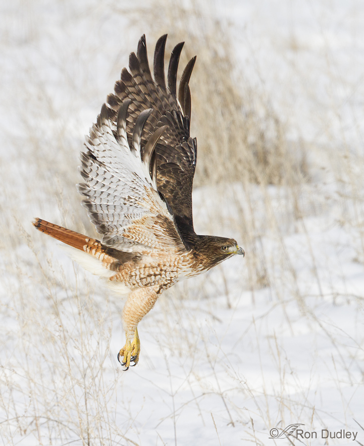
1/4000, f/7.1, ISO 500, Canon 7D, 500 f/4, not baited, set up or called in
This image was taken just over a month ago in such conditions (you can see from my camera settings that I had plenty of light). Clouds were thin, the sun was high (12:24 pm) and there was fresh snow on the ground – conditions that effectively eliminate shadow detail and can mute colors. When I processed the image using my normal work-flow (crop, minor exposure adjustment, selective sharpening) I was less than pleased with the colors and contrast in the hawk, especially with similar tones behind the bird.
Normally I don’t even touch saturation or contrast when processing an image but in conditions like this I sometimes make an exception and selectively increase both saturation and contrast to the bird by a small amount (+5 to 7 on each slider) and when I did I liked the results better. One must be careful not to overdo it. In my opinion more nature photographs are ruined by excessive use of saturation and contrast than by any other errant processing task. Many photographers want their subject to “pop” out of the image (I dislike that term) but all too often because of colors that look unnatural it “explodes” instead. Even here I may have increased the reds of the tail too much for some tastes but they look pretty good to my eye.
I’m no processing guru and I’m not saying I’m right about this and those who do it differently are wrong . This is just the way I do it…
Ron
Ron, oh how I envy the ability to shoot at 1/4000, f7.1! When I return home to California, I’m always struck by the dramatic difference in light quality (and availability) as compared to the Pacific Northwest. That being said, I think you did a beautiful job in shooting and processing. When you say that you rarely touch the contrast, etc., do you mean even with RAW files? My Oly jpegs are very nice SOOC, but I most often shoot RAW and find that slight contrast control is a regular adjustment, along with sharpness. I totally agree with you about over saturation. I hope that trend is waning, but I still see a lot of it, especially in landscapes. I used to say that a lot of digital photographers seemed to be striving for the Maxfield Parrish look. 😉 I know people get excited about having these tools at their disposal. Perhaps subtly then comes with time.
Hi Ron, I think the whites in the wing, leg, and chest might be a tad bright but I would take that picture in a second under those conditions, great job!
A beautiful shot which I appreciate even more having just been in Yellowstone N.P. and experienced the effects you mention. I’ve also seen Red-tailed Hawks now, and can see why they feature regularly in your posts!
Love this Ron. Thanks.
Darn near a perfect exposure. I envy you your problems with the light; mine are the opposite.
I think the colors are very good on the hawk but I agree with your concern the tail might be a bit too bright. Perhaps excluding the tail from some of the saturation?
The other slider that gets misused is the Shadows/Highights slider. There are limits to the powers of post-processing, no matter how skilled. If it’s jet black, under-exposed, all of the Shadow adjustment in the world isn’t going to recover detail; if the whites (or any other color) are blown, all the Highlights slider adjustment available isn’t going to recover detail that isn’t there. Just makes it look funky.
But I love theshot.
I agree with you about the Shadow/Highlights slider, Jim – we’ve both seen a lot of problems with that on NPN, haven’t we? You’ve got a point about the red saturation, next time I’ll tone it down selectively a little.
I wish you light! I know it’s at a premium in Alaska this time of year. It’s coming on fast, though…
Exquisite…
Oh my.
One of the most beautiful shots EVER!!! Composition, background, detail of bird, wing position…just the right amount of “editing” (saturation) to bring it up to the reality of what your eyes saw…so we could see the same…This, like the magpie and the eagle with the fish is another real prize winner! Is this with the new, or the old, camera?
Thanks, Patty. Actually I didn’t buy a new camera, I bought a new lens. This was taken with the new lens.
I think you did a great job with the processing on this.
Thank you, David.
To my eye Ron I like it. The bird does “explode” out of the picture but in a natural way!
You’re right about that type of “explosion” here, Nancy. This bird had just lifted off after an unsuccessful attempt at a vole in the snow.