
Occasionally I have second (or even third or fourth) thoughts about an image. This is one of them.
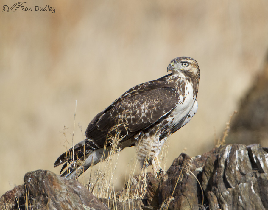 1/1600, f/6.3, ISO 400, Canon 7D, Canon EF 500mm f/4L IS II USM + 1.4 tc, not baited, set up or called in
This older photo of a juvenile Red-tailed Hawk has never seen the light of day because initially I had several reservations about it and then it just got lost in my archives and it’s been off my radar ever since. But last night I stumbled across it once again and decided it was worth another look.
Three things bothered me about the image:
- Because the bird is standing behind the foreground rocks those rocks are soft.
- I wish the grasses were on either side of the hawk instead of in front of it.
- I don’t have quite enough room on the left to give me the composition I’d prefer.
None of these shortcomings by themselves would be enough for me to nix the photo but in combination they were just too much so I shelved the image.
But over the years I think input from my readers has softened some of my hard edges (you often tell me I’m too critical of my photos) and I’ve now had a partial change of heart about this one. I’ve decided that this beautiful, statuesque hawk is so dominant in the image that I’m able to largely overlook those imperfections and enjoy the image for what it is – a detailed look at a magnificent raptor in a natural setting.
Yes, I’m pretty set in my ways (I often facetiously tell friends who make fun of me for that trait that my middle name is “Flexible”) but maybe there’s hope for me yet…
Ron
Ron, so glad you did not cull this one. The bird is spectacular. I can feel him look right through me. His plumage is al visible also. He looks alive. Thanks Diana
We are our own worst critics, aren’t we? For me, the foiliage in the foreground drives home the fact that this is natural. That Nature is the winner here. 😀
I can (kind of) understand your feelings about the grass, but it is in its natural elements. Therefore, the grass doesn’t bother me. That Hawk has gorgeous eyes. Just starting to turn color. Great capture. The intent look on the birds face is nice.
Ron, I understand your original thoughts about the image and I think they’re all valid critiques. But I don’t feel they turn it into a bad image, just one that perhaps isn’t worthy of a portfolio of your very best images. I do feel it’s still a strong image for showcasing the hawk. The eye was the first thing I focused on, not the slight distraction of the foreground. And despite the grass and rocks there is a lot of great detail in the hawk. I think it’s a perfect image for education and appreciation of nature.
Good points, Todd, and I agree. Thank you.
Perhaps now you are starting to understand why some of us would dearly love to spend a day (or six) dumpster diving in your discarded images.
The hawk dominates the photo. The other minor glitches are just that. Minor.
You’d have to go through a lot of garbage to find many decent shots in my discards, EC. But I do save a fair number of marginal images for a variety of reasons so you probably could find some interesting stuff in that folder.
Ron which Focus do you use when doing birds on the 7D? I will assume your doing a back button focus in AI Servo mode. What setting do you have for sitting and flying birds. Do you use Manual Spot AF Point, Manual Single point Auto Focus or Auto Focus Point Expansion.
Joe, I seldom use the 7D anymore but when I do I always use back button AF and AI Servo. My settings are all over the place depending on the situation but for perched birds I usually use a single active AF point on the eye of the bird. Typically I use the 5 center points activated for birds in flight.
Also…I like the composition…the focal point (bird’s eyes) and the main massing (bird’s head and larger portion of rock) are in 1/3 from edge, take up 1/3 of “canvas” ..so it works nicely…
Yup, good ol’ “rule of thirds”. I seldom think about it consciously but I often compose that way, instinctively I guess…
I was never “distracted” by the rock or the grass…the image and detail of the bird was much too powerful and compelling. When I did finally notice them, I liked them and thought they added a pleasing element…
Actually what I like about it is the composition – with the nearly parallel lines of the rock on the right and the hawk’s chest and back. Because of that, it doesn’t bother me at all that he’s centered – it’s not stagnant. The eye has a lot to move among. And I don’t really mind the grasses in front of him – they’re not big enough to really obscure anything and are a nice indication of habitat. But I love the bill in profile, the intense eye and brow, and of course the fact that it’s a raptor! Just my two cents!
Louise, I’m ok with the composition the way it is but I do think I’d have liked it a little better with more room on the left.
Of COURSE you’re absolutely right in you changed mind! This is a stunning image, and even though it’s a redtail hawk and y’all know about me and redtails, it’s just GORGEOUS in its inherent natural, raw beauty. The sharp focus on the bird’s intensity of gaze and the exquisite detail in its plumage and stance makes this all work, despite its (perceived) imperfections or maybe because of them! Just Oh WOW (insert string of unused superlatives here)!
And as Patty said, “there’s hope for you yet!” 🙂
Laura, this bird had a sibling just as magnificent looking as this one. You’d have gone bonkers!
HURRAY! YAY! FANTASTIC! There is actually hope for you yet!!! It’s a beautiful image, rock, grass, and all….AND YOU ACCEPT IT! You are willing to share a magnificent image that few of us would ever be lucky enough to see!!!
This is what I would see if I was lucky enough to be there. It’s a beauty!!!
I’ve come a long way, baby! And viewers like you have helped me get there, Patty.
I ‘m very, very proud of you!!!
Nature is not neat and orderly! (Unless we are looking at fossils of ammonites, spiraling gorgeousness)… The photo is fantastic – I think all of us are drawn to the faces of these magnificent creatures that you capture digitally – I know I am – the background rocks and grasses are complimentary
“Nature is not neat and orderly”
Boy, isn’t that the truth, Nicole!
Hi Ron.
I don’t have a problem with the grass, or the rocks however in a perfect world the grass would have been nice to the left leaving a better view of the bird. For my taste, I would like to see the bird a little more left in the frame and like to see more of the background rocks on the right. The bird is just a little too centered for me. I know you are a purest re replicating natural colors, but for me, I would add a little saturation to make the image “pop” a bit more. Hard to say because of the web posting process. The original might have a little more saturation.
Anyway, nice habitat image. I have one similar I got this summer in the Upper Ruby. July Redtail on the ground with some of the same issues (grass in front of the bird) But the rocks in the photo have orange lichens on them which to me adds some flavor.
Frank
Frank, I agree that the bird is too centered in the frame but I’d rather have it further to the right (rather than the left) because that would leave more room for the bird to “look in to”.
This is a gorgeous image. In the end, after I was through being distracted by the grasses, the bird seemed to lock eyes with me. Life is all about growth and change, and some of do it faster and easier than others. Even if change is difficult, achieving it is well worth the effort, and it’s a much better choice than ignoring the need/possibilities for change. And coming to a point where you see an image differently is not the same as dropping your standards.
“coming to a point where you see an image differently is not the same as dropping your standards”
Excellent point, Susan.
Beautiful shot, Ron. The hawk so dominates the photo that the slight softness is hardly noticed, nor is the lack of space on the left! I’m glad you changed your mind and posted it! 🙂
I agree about the dominant role the bird plays in the image, Judy.
It’s a wonderful shot Ron!
Charlotte
Thank you, Charlotte.
What makes this work for me is that all of the out of focus areas connect and encircle the hawk. The in focus grasses are slightly distracting, but my eye doesn’t stop there for very long, hardly at all actually, before leading me back to the bird. Being the same color as the background\d vegetation helps minimize the distraction. The intensity of that gaze makes the head the focal point of the image and demands my attention. Works for me!
Thanks for your thoughts on the image, Neil.
We are so critical of our own photos while others see the beauty and appreciate the devotion that goes into capturing the images. I love this hawk’s fierce eye against the soft background. Really appreciate your descriptions of how you got the photo and settings too.
Thank you, Devra.
I enjoy the game of trying to find what you don’t like about the image before I read what it is. I am getting spot-on. It is also helping me with my own composition as I shot. I like the soft focus of the foreground it takes the eye more to the sharp intense stare of the hawk. the back ground colors are beautiful. I agree it would be nice if the grass was not as tall overlapping the bird.
Sounds like I’m getting too predictable, April! 🙂
Ron–
The softness of the rocks doesn’t bother me at all. In fact, it can almost be a slight positive. The grass I notice…but then I pretty much forget about it. My attention goes to the bird and stays there: the eye, the profile of the head and bill, and the sharp contrast between the bright white feathers on the upper breast and the dark feathers on the wing make it a wonderful photo. I understand that you have exacting standards for your work, but for most of us the positives always put any slight negatives far in the background of our minds. Keep ’em coming !!
I appreciate your thoughts on the image, Jeff. Thank you.
Ron,
If Jeff Tufts’s comment was a Facebook post, I would like it. Very nice!
Cheers,
Dick