
It’s unusual for me to struggle with the composition of my images but these Turkey Vulture photos are an exception.
1/500, f/6.3, ISO 800, Canon 7D Mark II, Canon EF 500mm f/4L IS II USM + 1.4 tc, not baited, set up or called in
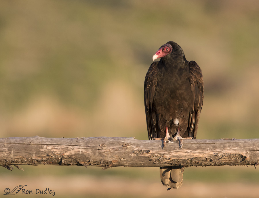
I photographed the vulture in Box Elder County yesterday morning just after sunrise so the light is very warm. It has a stray white feather above its left foot that makes me smile because to my eye it almost looks like an inverted belly button. Typical of the species its feet are stained white by its own droppings. These birds deliberately defecate on their own feet and legs for reason’s I’ve covered here.
I have a soft spot for photos of birds perched on old rustic logs or wooden fences (this log is part of a corral) and these images are no exception. For me they have an “old west” feel (especially when the bird is a vulture) that I like but there’s another wooden pole below the one we can see in this image so I’ve struggled with their composition. In this version I like the bird placed to the right in the frame and looking down the length of the log. But we can’t see the log out of frame at bottom and since I know it’s there I miss seeing it…
1/500, f/8, ISO 800, Canon 7D Mark II, Canon EF 500mm f/4L IS II USM + 1.4 tc, not baited, set up or called in
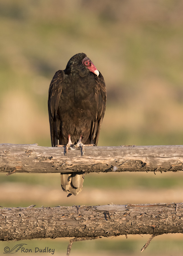
Here’s another composition of the same bird in a different but similar pose that includes the second log. I like this one too but cannot decide which one I prefer and while pondering the question I began to wonder if my readers might have a preference. So I decided to present them both and hope for some feedback. If you prefer one composition over the other I’d be interested in knowing which one.
By the way, if anyone’s wondering what happened to that white feather in the second image, it’s there. Do you see it?
Ron
Ron,
Slight preference for the top image. The framing is more pleasing, I think the off center catchlight is nicer, and the bokeh is a little less distracting. The slight change in f-stop helped out there, I believe. Both are really pleasing images!
I’ll stay with the top one. The bottom shot, with its two logs, has a repetitive element that harms the overall composition while not adding any interesting information. The two logs and the gaps between and around them are too similar, making the design less interesting.
Excellent shots!! And thanks for the link to your previous post regarding eating and “cooling their feet!” 🙂 A couple of years I was walking down a road here, and there were about 30 turkey vultures resting in the trees. A woman with a child in a stroller was also walking, and to make conversation, I said, “Those are turkey vultures.” Looking up at the birds, she said, “Wow! You mean they eat turkeys?”
Ha, I actually see how a child’s mind could make that jump, Jane. Interesting encounter.
I forgot to ask. Did your first picture include the second rail but you have cropped it out? That might make everyone happy!! lol
No, it didn’t, Carol. Shooting horizontally the second rail wasn’t included. I had to shoot vertically to get both rails.
I discovered your blog a few weeks ago and enjoy your posts immensely. I vote for photo #2 and agree with Dick Harlow. I too find the white feather on the belly distracting but love seeing it on the fence rail in the 2nd photo. I really like the softly blurred background as it does not detract from the bird or the fence rails. A beautifully composed picture.
Tough choice! I like the first one, maybe for the simple reason that it fits the computer screen better than the portrait version. I do find the white feather distracting though.
Either way, you make one of the ‘uglier’ birds look great!
I prefer the first photo (and like them both). The first photo engages me more. The empty space which he faces ‘begs’ to be filled. So I see this as possessing a dramatic tension and sense of expectancy. I like this a lot!
I’m glad that you needn’t choose between a few favorite photos for your blog. I also appreciate you like to hear the basis of your readers’ preferences as you continue to shape your practice…
Thanks very much for all the feedback everyone! So far the results are: photo #1 = 8 votes, photo #2 = 6 votes.
And with all that input and discussion I still can’t decide for sure which one I prefer but I’m leaning toward #2…
Oh, on the white feather. Jack (the HH) is sprouting white on his dark feathers, which are getting larger each year. He’s 16 this year, so I’m wondering if the trend will continue. There are several other older HHs that are doing the same thing, and we’re wondering what’s going on here. Is it akin to gray hair? Jennifer and Tom Coulson are studying the issue from the perspective of their birds. Whether it is or not is an intriguing question, isn’t it?
Personally, I like the second composition. To me, it gives a better idea of the bird’s environment. But that’s just me. I don’t like a lot of blank space. I’d rather see the background, assuming the background isn’t something ugly. In this case, it’s gorgeous, especially with the weathered fence rails.
I like photo #1
Too bad you couldn’t get a two-rail, two-bird shot, then you’d have a hash tag…
OK! If you REALLY want to impress us, how about a picture of one of these guys defacating on his feet…especially on the FRONT of his feet…a seemingly impossible feat…:-)
Patty, vultures are pretty talented in that way. Hawk/vulture poop is pretty slimy when it’s fresh, so it sorta slides down and spreads. Hawks send it far away from them, which is why hawk poop is called a slice (think about the word sluice). Vultures use it for bacteria control and cooling. It’s not MY chosen way of doing things, but it works really well for them. I love vultures. They’re cool folks!
I’m with you. I don’t like to poop on my feet either!
I vote for the one log photo. With two logs I get distracted and look at the logs rather than look at the bird. And thanks for the info on pooping on their feet. I did not know that and my a what wonderful fact to bring up at an inappropriate time! (That’s my 7th grade mind working again)
B – I think we share a similar sense of humor!
The first image is more appealing to me. I like the subject off-center and the gaze down the fence line helps to provide even more “openness” to the photograph. Bird photographers are tempted to frame images somewhat tightly to show off the details of the subject. I prefer your image as it displays the entire setting and – the way you handle your composition – the subject bird is still very much the highlight. That white feather doesn’t bother me at all. It’s a bird. They’re all unique and don’t deserve to be “air-brushed”. Just my opinion.
In the other image, I also really like that second fence rail. It’s much less worn and very rustic looking. So, here’s what you do. Simply swap out the top and second rails (I’m sure the owner won’t mind, but just in case, do it at night), wait for the vulture to pose for you again and you’ll have your favorite subject on your favorite rail and won’t mind showing just the one rail!
(I find it once again necessary to apologize for not visiting for awhile. Just when I though life would leave me alone for awhile, it didn’t.)
Interesting! Very nice shots!
We had three Turkey Vultures one of which landed on one of our bird boxes. Yes, I got an average picture, but had to take it through a window. The other two landed on the ground under the bird boxes, probably picking up scraps from Kestrels and Red-tails that have also used these boxes to hunt from. Now all the boxes have tenants, mostly Tree Swallows.
I find Turkey Vultures a necessary environmentalist for all the clean up they do in the woods and fields.
As far as which picture I prefer, probably the second one. For two reasons, the small white feather on the belly of the first shot that you talked about in your post is distracting to me, plus I just like seeing the two rustic logs in the second picture. Unfortunately I can’t give you a better reason than that.
Definitely like the first photo the best. I love that this guy is off center….kinda like…..well you know….some of us think these birds may be just a little “off center”. I like the way he is looking back towards the empty space. It balances the photo nicely. The feather is just a bonus!!
I find the 2nd image is more unusual, the 2 parallel branches add interest.
The first is so classic and lovely though.
I have to say I’d have a tough time choosing. I’d be likely to choose whichever fit the layout requirements of its use. It’s nice to have 2 great shots- one landscape and one portrait!
Hi Ron–I vote for the second–a very nice composition, in my opinion . I’m pretty sure I’ve spotted the new position of the white feather, and am wondering if it was “itchy” ?
I don’t think the feather was “itchy”, Kris. I watched it blowing in the breeze while it was still on the bird and then it just blew (fell) off and I happened to click my shutter when it did.
I like them both, but like the second a little better…the white “belly button ” is distracting and having looked at two or three rails for so many years, seeing just one looks incomplete. I like the composition and the space in the first and the new position of the migrant feather in the second…
Yes I have a preference. I choose the second one mainly because there is more space under the bird and the second log doesn’t bother me. In fact I like it.
As for the feather I think I see it a little bit down to the right of the bird’s left foot.
Being a Nikon fan recently converted to Canon ( I had no choice) I could not resist to compare the settings that you have used on this bird to the settings that MIa used on the same bird. We are talking here of two 500mm prime lenses with a 1.4 tc attached and opening both at f/4 and definitely at least for me your lens is much better in terms of sharpness and colour rendition.
I apologize for this out of context opinion but I couldn’t help it.
Jorge, when comparing the two images regarding sharpness there’s several variables that I think need to be considered.
Mia shoots with the Nikon D810 which has both FX (full frame) and DX (cropped sensor) modes. Based on the fact that she has more room to the left than I did I suspect she was shooting full frame when she took this shot which would give her less “magnification” and possibly less detail.
Also, I had more shutter speed than she did (I was at ISO 800, she was at ISO 500) and that could have played a role in sharpness in this low light.
Judging sharpness at these low resolutions for the web is a tricky proposition. Mia is actually pickier than I am about sharpness in her images and I suspect that her image is actually sharp at high res but her bird is smaller in the frame so we may see less detail.
I admit I can be wrong because in my professional life I don’t have to bother with ISO or shutter speed, only with F numbers since I shoot on studio with continuous light, but the way I see it comparing those settings is that f/7.1 gives more detail than f/6.3 and ISO 500 is less noisy than ISO 800, so in the end it should give more sharpness.
What I didn’t think of was that these images have low resolution for the web and that changes everything.
Always learning…
Thank you for your feed back.
I prefer the first photo because of the open space to the left. I also like the white spot. I live a couple of blocks from the New Mexico State Univ. Horse Farm where migrating vultures roost on the iron pipe fences. We get a lot of them flying over our neighborhood when there is air movement. Love watching them soar with the movement of their tails. It is fascinating to me. Also in the mornings, they sit with their wings spread out warming them. Never thought I would like birds like this, but I do.
Both very lovely, but I like the second photo the best. The bird’s neck is tucked down a little – and the white tip of his beak shows through more clearly against his wing. Plus I like how his head and shoulders form a pleasing curve against the creamy background.
Both a beautiful, Ron but I do prefer the 2nd one with the vertical nature of the bird.
I prefer the first photo for the same reason Joan mentioned. As for the white feather in the second image, yes I see it, but don’t want to give it away for your other readers. : )
Good morning Ron:
Nice shots of the TV.
Yes, Both are nice, but I certainly prefer the first. I find the second railing in the second photo to be distracting. On the other hand, the white (???) on the lower front of the bird in the first photo is not pleasant. Do you comfortably clone out things such as this? (i.e., what would your opinion be about cloning the white spot out?)
All this said, great focus, exposure, composition, etc., on both birds. Thanks!
“Do you comfortably clone out things such as this?”
No, I don’t, Richard. I’ll clone out dust spots and occasionally dark spots on the surface of water but not much more than that (except for rare exceptions but when I do that I always disclose what I’ve done). Since that white feather was an integral part of the bird when I took the photo it only seems honest to leave it in.
I probably have other shots with that composition taken after the feather blew off but honestly, it really doesn’t bother me much.
I prefer the first (top) photo but both are excellent. I like to see a lot of space in front of where the bird is looking and this photo opens the imagination to what the vulture might be contemplating.
“I like to see a lot of space in front of where the bird is looking”
I like that kind of composition too, Joan – in fact I’d have left even more space to the left if I had it. But since I had my teleconverter attached to my lens I didn’t have it. I had to choose between that composition and more detail in the bird.