
Snow on the ground can do weird things to light.
It’s often an advantage on cloudy days or when the sun’s high in the sky because snow reflects light to the ventral surface of the bird and reduces heavy shadows there. But I find it difficult to predict which exposure value (ev) is best when there’s snow on the ground. Sometimes I have to significantly increase exposure and other times I have to decrease it in what seems to be almost identical situations. Go figure…
For these two shots, taken yesterday morning at Farmington Bay WMA, I had my ev set at +1.67 to get proper exposure on the dark hawk in the white setting. When I fine-tuned exposure during processing the bird was slightly overexposed so I reduced exposure in Photoshop ACR (Adobe Camera RAW). Doing so caused no problems – after all, many photographers “expose to the right” deliberately and then make adjustments during processing.
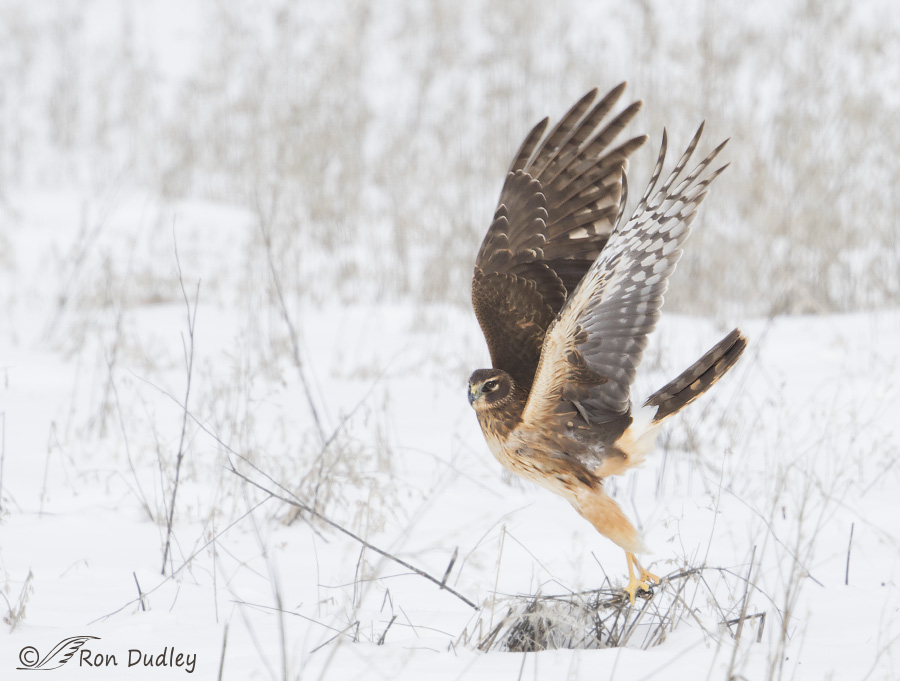
1/1250, f/7.1, ISO 500, Canon 7D Mark II, Canon EF 500mm f/4L IS II USM + 1.4 tc, not baited, set up or called in
I think harriers have some of the most athletic takeoffs of all raptors, partly because they perch on the ground more often than many other birds of prey so it takes more effort to become airborne. This bird took off in just the right direction to give me a good look at its face and provide a side view of that dramatic takeoff posture. I even got some light in the eye in these cloudy conditions.
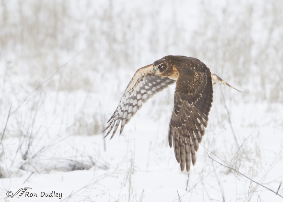
1/1600, f/7.1, ISO 500, Canon 7D Mark II, Canon EF 500mm f/4L IS II USM + 1.4 tc, not baited, set up or called in
This is the only shot I got of the bird in flight where I liked the wing position and the bird was sufficiently sharp.
Normally I don’t increase saturation or contrast during processing because I like my subjects to look natural in the light that exists. I’ve said before that in my opinion over-saturation is the most common processing “error” made by novice (and even some pro) nature photographers. To my eye over-saturated birds look more like cartoon characters than natural products of evolution. It makes me wince when I see comments about an over-saturated image like – “wow, that bird really pops”.
That said, when I have an image taken in low light I sometimes do increase saturation and/or contrast selectively on the bird because natural colors are often muted in those conditions. For these two images I increased both saturation and contrast moderately on the bird only. (To be perfectly honest, the more I look at these two images the more I think that I might have increased contrast just a tad too much – live and learn).
I’m not saying my way is the only way or even the best way, just that this is what I do.
Ron
Ron, I just discovered your site after a comment from a co-worker today. I have been out to Farmington Bay three days this weekend and didn’t see any eagles. Suggestions? Are they gone? Best time of day? Best location?
Thanks,
Stephen
Stephen, To be perfectly honest I’m not the best one to ask about the eagle situation at FB. I don’t go there very often during eagle season anymore because I don’t much like the circus atmosphere out there. But when I have gone recently there’s been very few eagles and they’re all very far away. If it tells you anything I don’t have a single FB eagle shot from this winter.
Hello Ron,
My name is Terence, I would like to ask…why shoot in Raw vs jpeg?
Hi Terence, Here’s a link that should answer your questions:
http://digital-photography-school.com/should-you-be-shooting-raw/
Great shots and advice Ron! Thanks?
Charlotte
Every choreographer that ever was could learn from birds.
Love, love, love the elegance and grace of that fling position.
“Every choreographer that ever was could learn from birds.”
Isn’t that the truth, EC. Thank you.
If it’s not broke, don’t fix it. Your work, and Mia’s, always present exquisitely on line.
IMHO, Post Processing is an adjustment to what the camera manufacturers have determined to be “normal and correct”. Canon’s is different from Nikon’s is different Sony’s, etc., etc. If you believe they have nailed it, thats fine. They have come close with the middle of the road approach, but have missed the mark when it comes to how I see and experience the world. I’m sure some disagree with that vision, but it is correct from my perspective.
I have presets built in Lightroom ( I use Photoshop sparingly these days ) that take my images to my “normal” on import. If I think it’s too much, I work backwards towards “capture” from there and “feel with my eyes” to my final, finished image of what, I believe, I saw.
First and foremost, having a color balanced system, Camera, monitor, printer, is absolutely critical to good, consistent final results.
Secondly, every image needs Capture Sharpening. The three color channels or wave lengths, (Red, Green, Blue,) focus at slightly different points on the sensor and need to be refocused to the same point.
Thirdly, if I do work on an image in Photoshop, I open it in the largest file and color space I can. For me, that is a PSD or TIFF in the PRO PHOTO color space in 16 bit opened and saved in Lightroom so that Lightroom remembers what I did and I can return to that point anytime in the future. I can also process and save as many versions of the original as I want in LR. Any and all changes are done to a sidecar file and the original RAW file is never changed, just like Adobe Camera Raw. In fact, the Develop mode of LR and Camera Raw in PS do the same things, just with different interfaces.
Lastly, if it’s going to the web in any way, email, website, etc., I export it from LR as a .jpg at 72 pixels per inch (ppi) in the sRGB color space (the smallest) that is the standard for the web. Working from the largest possible image to the smallest. I never work on jpegs in photoshop for several reasons and only make the conversion as the very last step.
Just my 2 cents
Interesting feedback from a professional photographer, Neil. You obviously know more about processing than I do and I appreciate hearing your perspective, as I’m sure others will. Thank you.
Thanks for the processing comments. Insight into how you get these wonderful pictures is important for us aspiring photographers. John
I hope the info turns out to be useful to you, John.
Gorgeous. I do agree that the saturation is evident (the buffs and salmony bits seem “too” visible, a touch), but I don’t think it detracts from the image. This bird is so powerful! And the photos give that power its due. Now, how about finding an adult male Harrier in the snow! White on white. Seriously, I’d love to see what you do with it.
Sally, the amount of saturation I applied was very minimal (I went to +7 on the slider). You could be right of course but to my eye it’s the contrast that is more suspect.
I’d love to get another adult male in the snow. I have older shots like that but nothing recent. It’s on my list, to be sure!
That second shot really captures the power to me.
Thanks, Arwen.
I love the raised wing take off, (what I call the “fling” position in the first) , the soft, snowy backgrounds and the “snowflake” echoes of the white spots of the under wing patterns….Beautiful!
“Fling position” – I’ll add that to my vocabulary, Patty. Thank you.
All I can say is that for the last several days your comments on processing have made a tremendous difference in what I do with my images. I began in RAW and changed to jpeg to save space. Now space is relatively inexpensive I’m going back to RAW.
I used to be bothered by the fact that if I wanted to deal with saturation, sharpening or contrast or any tweeking with the software i had, it did it to the whole picture. That was unacceptable and consequently many of my images lost out. With your posts professor my life and hopefully my images will change this year. Thank you for your candor and your knowledge, your willingness to share on your blog, i am forever grateful!!
I loved your comment, Dick!
Sometimes I fear that I come across as a know-it-all but I’m far from it. Others know processing far better than I do (I learned much of what I know from Mia – she’s a master). But I can’t help sharing what I do know and some of the methods I use.
I’m so glad to hear that what you’ve learned here has (and will in the future) make a positive difference in your images.
Lovely shots Ron! I couldn’t agree more concerning overly processed images in post processing…many to my eye are far too saturated in color and look so unreal. Thanks for sharing your expert view.
“many to my eye are far too saturated in color and look so unreal”
I couldn’t agree more, Gary. It may be “art” but IMO it isn’t “nature” photography.
I’m obviously no phototechy, but there’s one guy whose skies and subjects are so saturated with color they’re almost painful to look at…look more like a Disney “gel” than a photograph…nothing looks normal or right about them…very, offensively phoney looking….
WOW! Great shots! 🙂 Doesn’t appear to be too much contrast to me, but then I’m not on the computer looking at zoomed detail. 🙂 First shot is a fantastic “pose”! Snow does tend to complicate exposure for sure. Thx for sharing what you did.
You may be right, Judy. I’m unsure that I’ve increased contrast on these images a little too much but I am wondering about it. It’s a judgment call…