
I’ve been a fan of strong graphic lines in my images ever since my friend Richard Ditch introduced me to their potential a few years ago. The source of those lines may be natural or unnatural but since my subjects are mostly birds and many of them perch on fences, my graphic lines are often provided by fence wires. In some ways I’d prefer natural elements in my images but wires can also be compositionally and visually interesting.
1/2500, f/7.1, ISO 500, 500 f/4, 1.4 tc, natural light
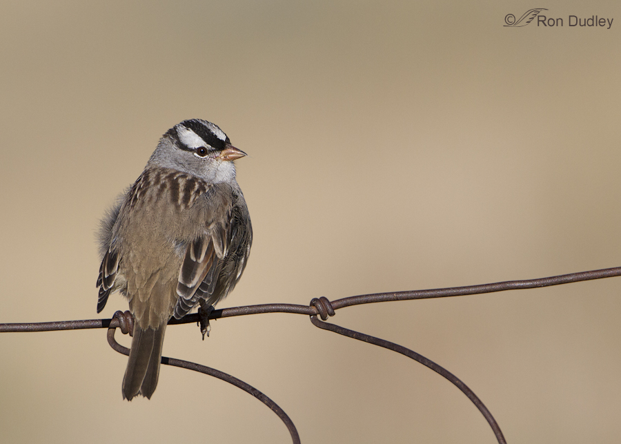
This adult White-crowned Sparrow flew in and perched on a nearby fence recently while I was photographing a Red-tailed Hawk in Montana’s Centennial Valley. The hawk was perched at an angle that was too steep so I momentarily redirected the aim of my lens toward the sparrow. At the time I didn’t have particularly high expectations for the sparrow images but while reviewing them I was immediately attracted to the strong graphic lines provided by the wire against the otherwise clean background.
1/1250, f/10, ISO 500, 500 f/4, 1.4 tc, natural light
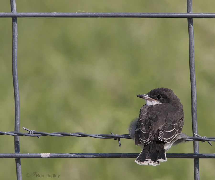
This is an older image, taken in mid July, 2008 near Farmington Bay. The graphic lines are particularly strong (which may be good or bad, depending on tastes) and I like the contrast between the apparent vulnerability of the Eastern Kingbird fledgling and the bold, almost aggressive-looking wire.
Unnatural wire and strong graphic lines won’t appeal to everyone and that’s as it should be – if we all had the same tastes, life would be less interesting.
But for me they sometimes contribute visually compelling elements to an image.
Ron
Works for me…
Fantastic photos. I like the strong graphic lines. Also the combo of man-made and animal.
Thank you, Nicole.
I love the contrasts. Hard-edged against the ‘softness’ of nature. Man-made against nature. And the symbolism of the bird crapping on that fence makes me smile too. And, like Patty, I love the information you give us – you enrich my world.
Thanks so much, Elephant’s Child. And you noticed what I did but probably used better words – “hard edged against the softness of nature”.
I’ll add my name to the list of those who really like these photos. The strong lines provided by the fences definitely add interest to the composition. I think that the man-made elements in photos like these are part of nature these days, as birds the birds use those items as an everyday part of their lives. In both of these photos, the colors of the fencing definitely enhance the birds sitting on them. For me that’s another example of serendipity.
I’ll take serendipity anytime I can get it, Susan – won’t we all!
Love them!
Thanks, Sharon.
I meant to add that even the white bird poop on the fence in the KB photo goes with the bird. I LOVE IT!!
Some folks would have cloned that “whitewash” out, Deb. I don’t even consider doing so.
I also loved the calligraphy of the WCS shot. It was the first thing I noticed, but what I love about both shots even more is the corresponding colors of the fences to the birds. Both pics are fascinating to me in that respect. I just love fencing in photographs. Especially if it’s old. I know barbed wire is a bad subject for some, but it is a big part of our history & can speak volumes in a photo!
I agree about the colors, Deb. Another thing Richard Ditch taught me is to appreciate “monochromatic” images like the sparrow image where most of the colors are variations of the same one.
Your photographs are so amazingly sharp and detailed , your subjects so beautiful and interesting, and your natural sense of good composition so strong, that whatever your background…or lack of one,whatever other elements, they are always pleasing and informative….most of all when they are coupled with comments on specific facts and behaviors That’s why I love this site so much.
Very nice of you to say so, Patty. I’m particularly happy that you like the “facts and behavior” aspects of my blog.
Your images are spectacular and I do agree with you. In these shots the graphic lines provide an additional enhancement to the image. Very artistic!
Thanks for sharing your shots and thoughts!
Charlotte
Thank you, Charlotte. I’m always surprised when anyone uses the word “artistic” to describe me – until I started photographing birds I didn’t know that I had an artistic bone in my body…
It would be interesting indeed to see more wildlife photography incorporating hand-of-man elements. There is something peculiarly human in the strict avoidance of “artificial” elements in nature photography wed to the use of photoshop to erase all blemishes from the “natural” subject, marks on the bills of birds for example. It would help the viewer appreciate nature’s complexity if photographers and those who publish their photos didn’t demand a highly artificial perfection in the subject and background. I love the White-crowned Sparrow above, wonderful shot. And the Kingbird fledgling also.
I couldn’t agree with you more about the tendency of many photographers to clone out natural imperfections, Kelly. I find the practice to be highly undesirable and even counterintuitive in “nature photography”.
Hi Ron, very nice. As you say, we all have different perspectives . I think the lines add a lot to the images, yet they do not distract from the subject. That is, they act like supporting actors in a play. I agree with the reference to calligraphy and I also think the fence “wraps” in the white-crowned image are evocative of a bird’s foot wrapped around a perch. A bird with too few toes, but hey, who’s counting…? Thanks, as always, for the visual poetry!
Interesting to compare the shape of the wire to the foot of a bird, Dick – something else I hadn’t thought of. Thank you.
I like the strong graphic lines, too. There’s an almost calligraphic quality to the photo of the White-crowned Sparrow.
Thanks, Alison. I hadn’t considered the calligraphy aspect but you’re right.